Nexus Expo

Nexus Expo

Nexus Expo

Brand Identity & UI/UX

Brand Identity & UI/UX

Brand Identity & UI/UX

A proposal for a convention dedicated to the popular MOBA game League of Legends.

Visual System

UI/UX

Branding

(write your alt text here) The image depicts a close-up of a person’s face, intricately intertwined with numerous cables and electronic components, creating a futuristic, cybernetic appearance. The person has a calm, almost meditative expression, with eyes closed and a serene look. The overall aesthetic is a blend of human and machine, showcasing a high level of detail in the mechanical elements, suggesting themes of technology integration and possibly the emotional or psychological impacts of such a transformation.

The Design Story

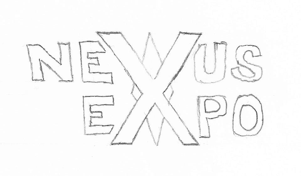
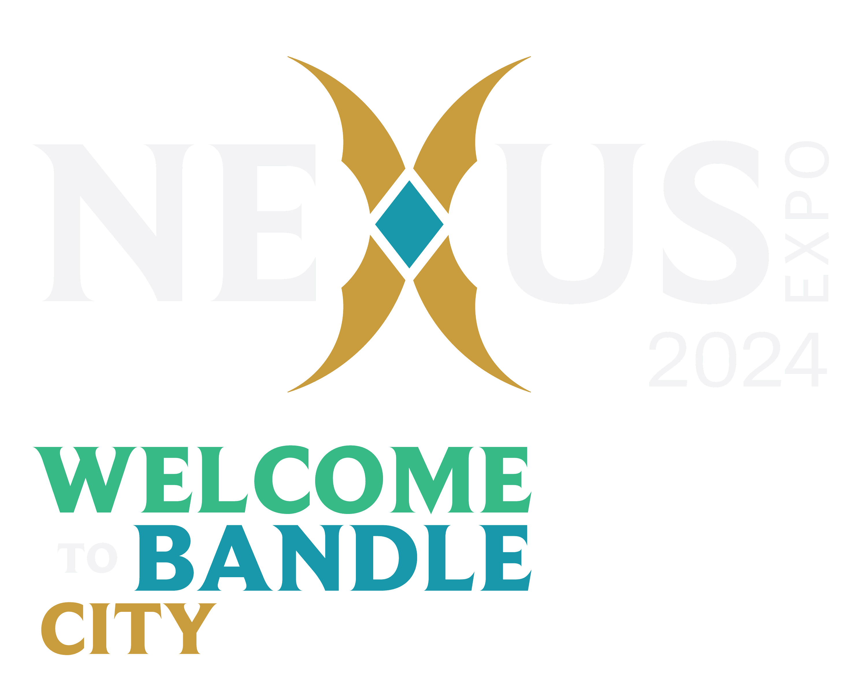
The design of the Nexus Expo logo plays on the motif of both the in-game nexus and the meaning of the word itself. By definition, a nexus is a connection or link; it is also a central focus where energy converges. This is exactly what a convention is - it is a place where likeminded individuals can converge and connect with one another. By taking the central letter of the word, "X", and converting it to an abstracted nexus, the logo embodies both the element from the game and the purpose of the convention.

The design of the Nexus Expo logo plays on the motif of both the in-game nexus and the meaning of the word itself. By definition, a nexus is a connection or link; it is also a central focus where energy converges. This is exactly what a convention is - it is a place where likeminded individuals can converge and connect with one another. By taking the central letter of the word, "X", and converting it to an abstracted nexus, the logo embodies both the element from the game and the purpose of the convention.

The design of the Nexus Expo logo plays on the motif of both the in-game nexus and the meaning of the word itself. By definition, a nexus is a connection or link; it is also a central focus where energy converges. This is exactly what a convention is - it is a place where likeminded individuals can converge and connect with one another. By taking the central letter of the word, "X", and converting it to an abstracted nexus, the logo embodies both the element from the game and the purpose of the convention.

(write your alt text here)The image depicts a close-up of a person’s face, intricately intertwined with numerous cables and electronic components, creating a futuristic, cybernetic appearance. The person has a calm, almost meditative expression, with eyes closed and a serene look. The overall aesthetic is a blend of human and machine, showcasing a high level of detail in the mechanical elements, suggesting themes of technology integration and possibly the emotional or psychological impacts of such a transformation.

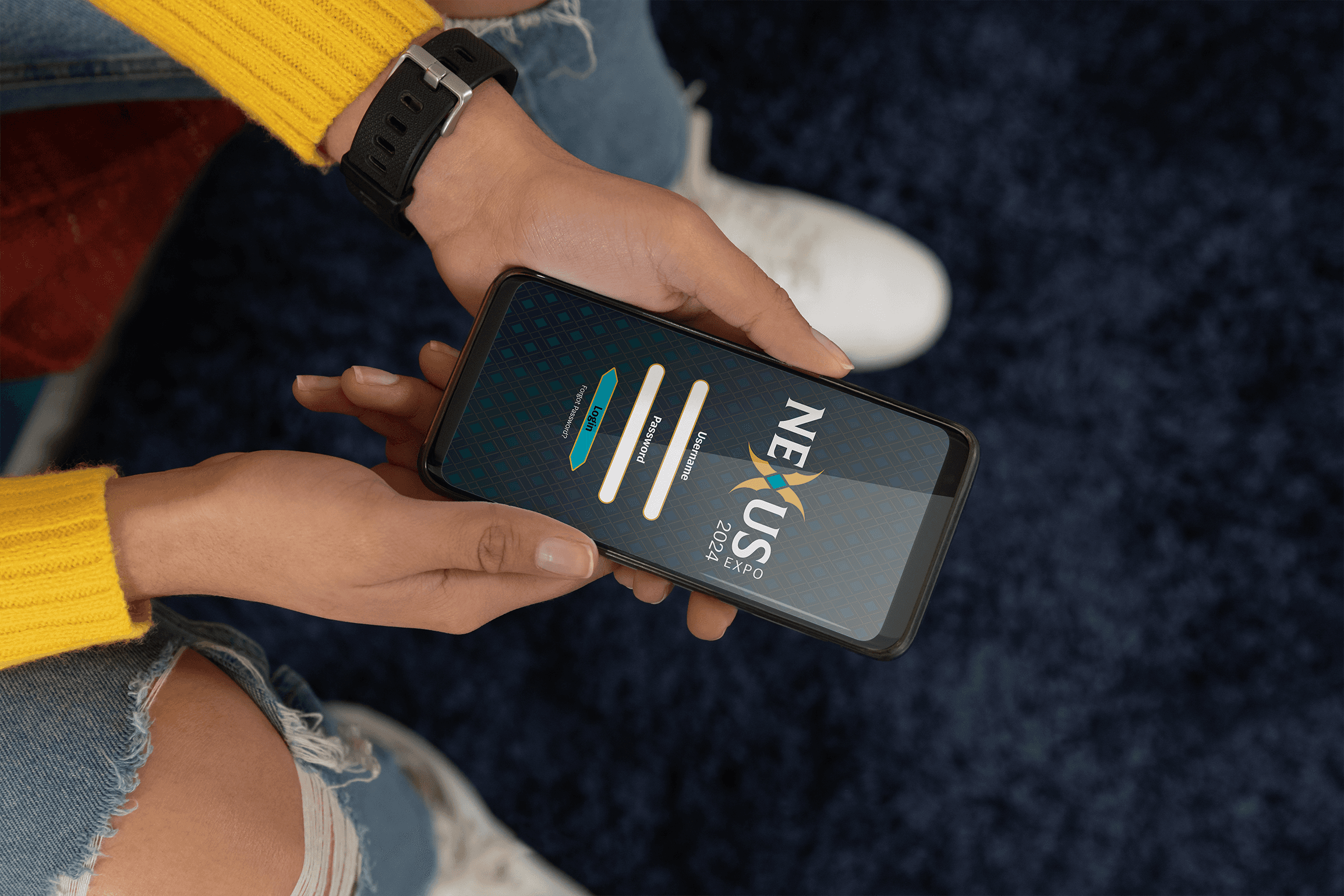
Companion App

(write your alt text here)

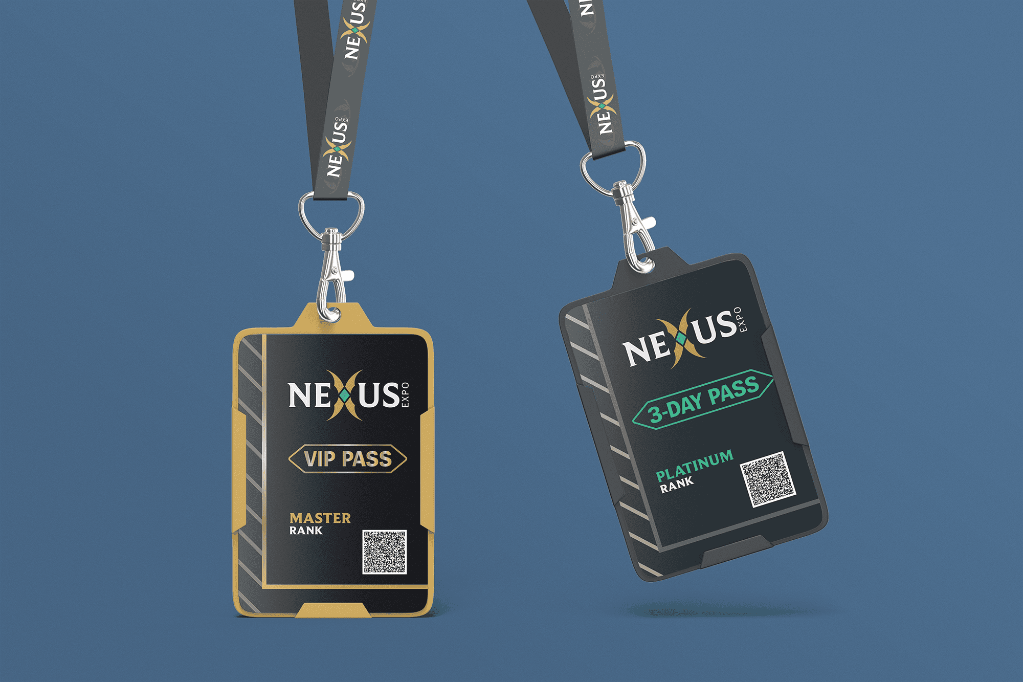
VIP / Multi-Day Passes

(write your alt text here)

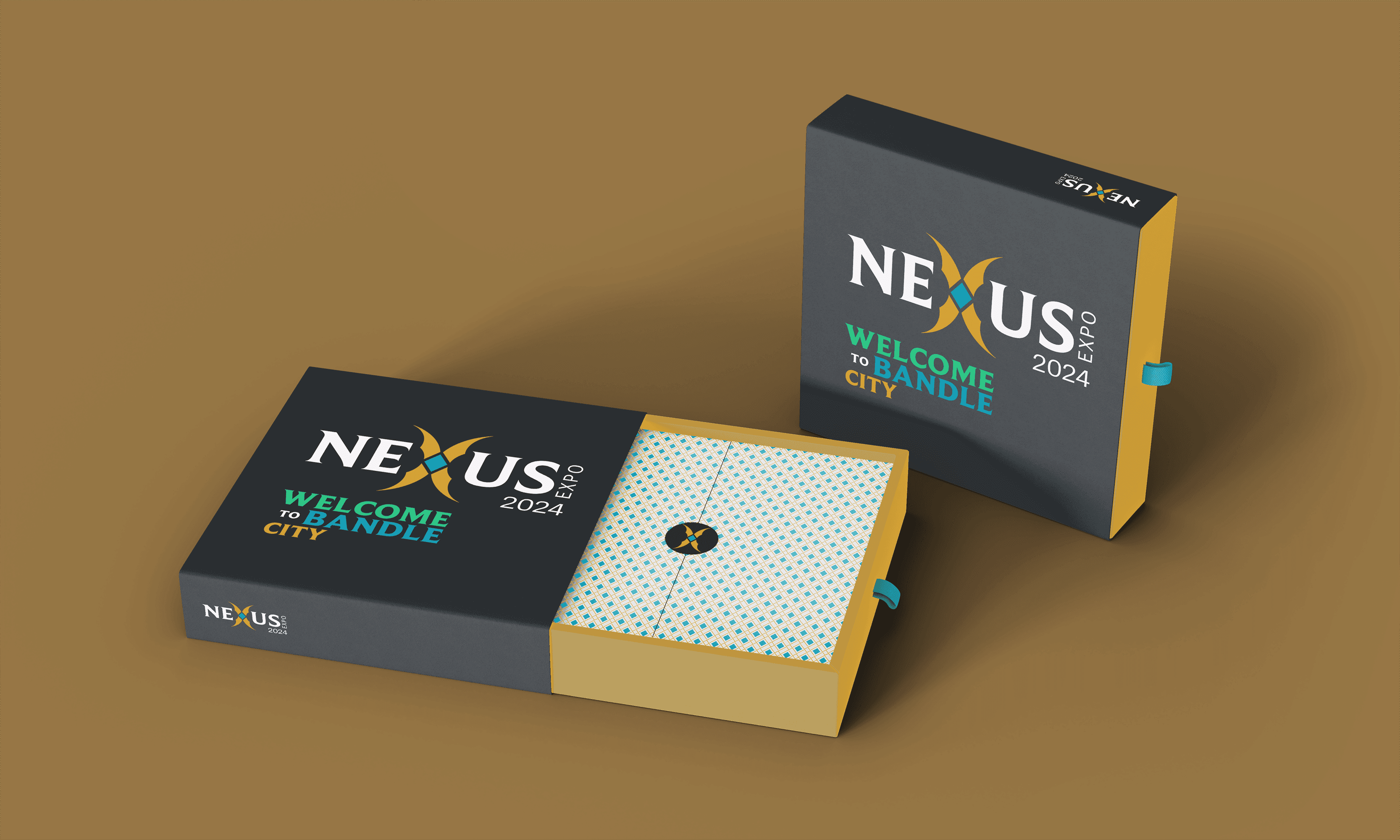
VIP Package

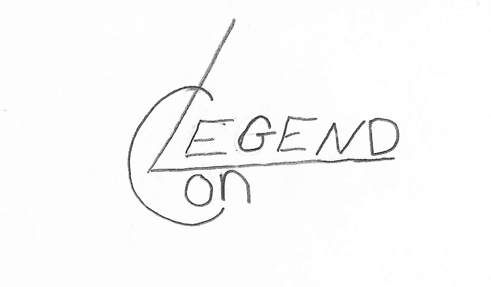
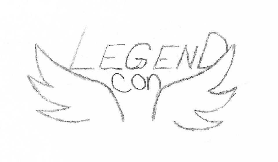
The original name of the convention was going to be LegendCon, which played on the name of the game itself. However, Nexus Expo was chosen in place of this because of the layered meaning of word Nexus in relation to the convention. The original ideation of the logo revolved around creating an icon that could be distributed alone and evoke a sense of power and strength, like the champions in the game.

Back to the top
Back to the top
Back to the top

©2024 All rights reserved by Chris Jenkins.